Surecloud
Repositioning and unifying a brand to support growth in a competitive market
Overview
SureCloud required a rebrand to unify two previously separate business areas and support its expansion into the US market.
I worked on the development and rollout of a new brand identity and campaign, helping translate a strategic repositioning into a clear, confident, and scalable creative system across multiple touchpoints.
The Challenge
The business was undergoing significant transformation — merging two distinct offerings into a single, cohesive proposition.
This created several challenges:
- aligning messaging and identity across previously separate parts of the business
- standing out in a highly competitive and technically complex GRC and cyber security market
- ensuring the brand felt both credible and distinctive
- delivering a system that could be adopted quickly across internal teams and external communications
The project also required flexibility, as priorities and direction evolved throughout the process.
The Approach
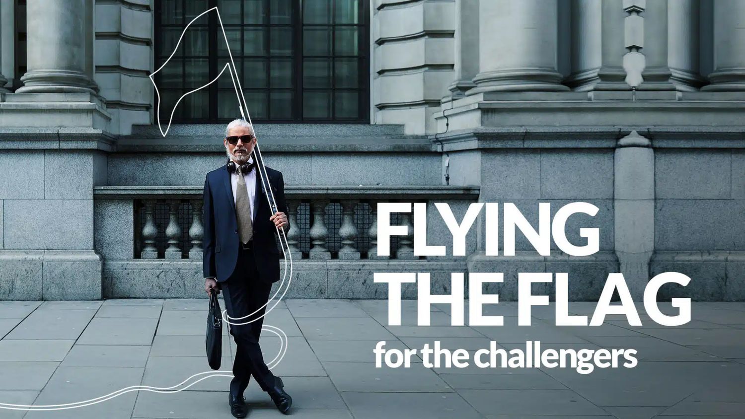
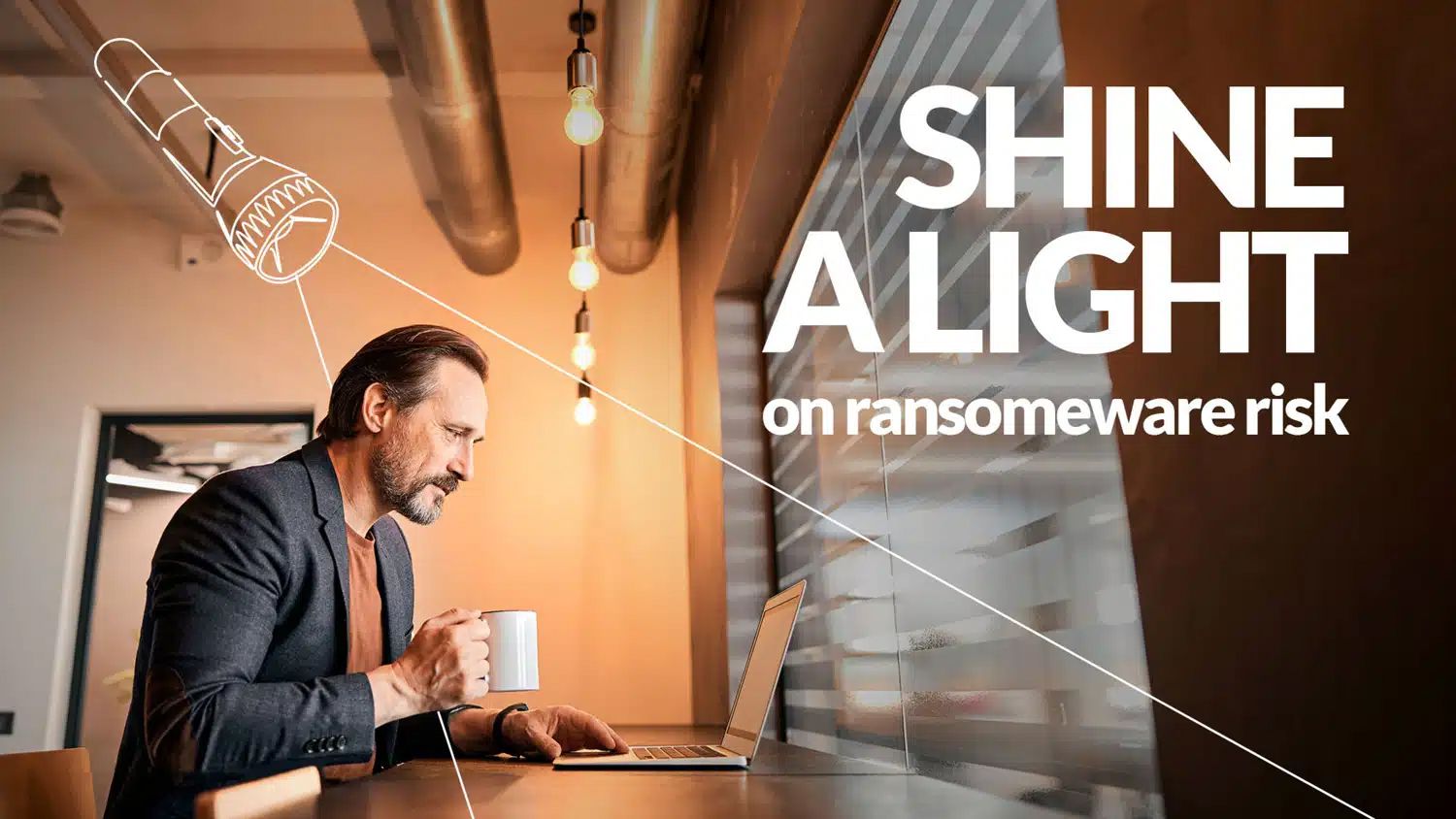
The creative direction centred around simplifying and strengthening the brand’s core message — positioning SureCloud as a confident, solutions-focused partner.
I contributed to developing and applying the “Sure You Can” concept, translating it into a clear and consistent visual and tonal system that could work across a wide range of outputs.
From a design perspective, this meant:
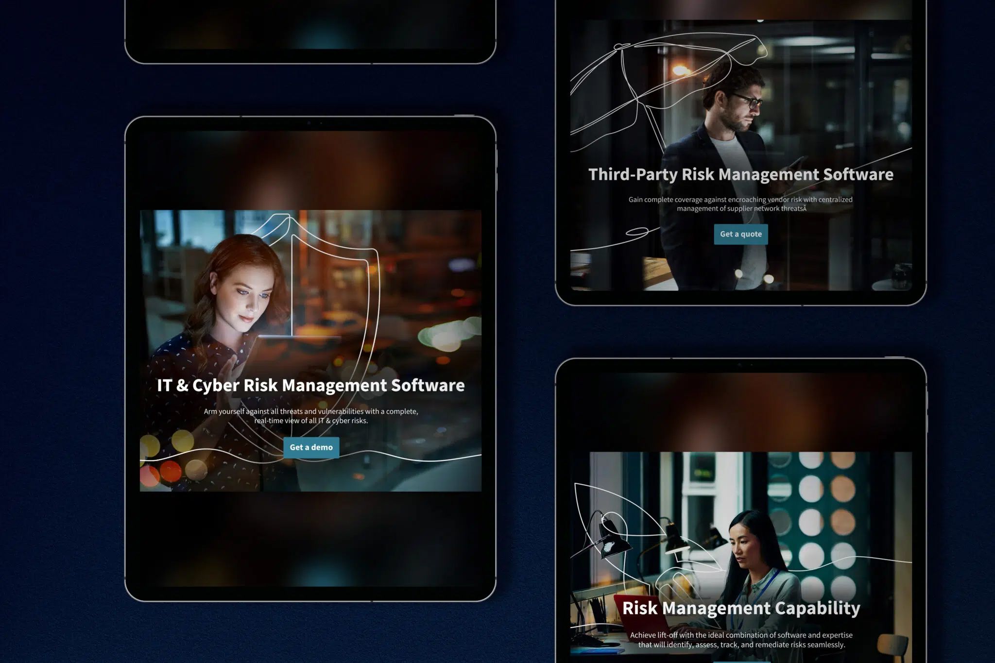
- creating a visual identity that felt modern, confident, and accessible
- ensuring the concept could scale across both campaign and everyday brand use
- balancing creative expression with clarity and usability in a technical category
The focus was on building a system that not only looked strong, but worked effectively in real-world application.
Execution
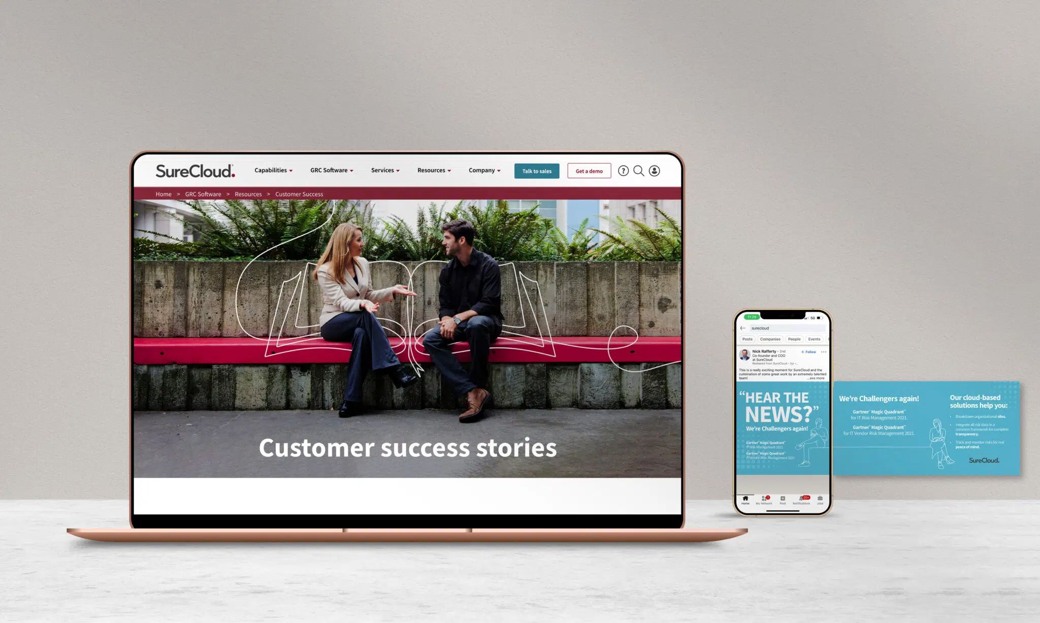
I worked across a broad range of deliverables, helping bring the new brand to life across both internal and external touchpoints.
This included:
- Website design and supporting digital assets
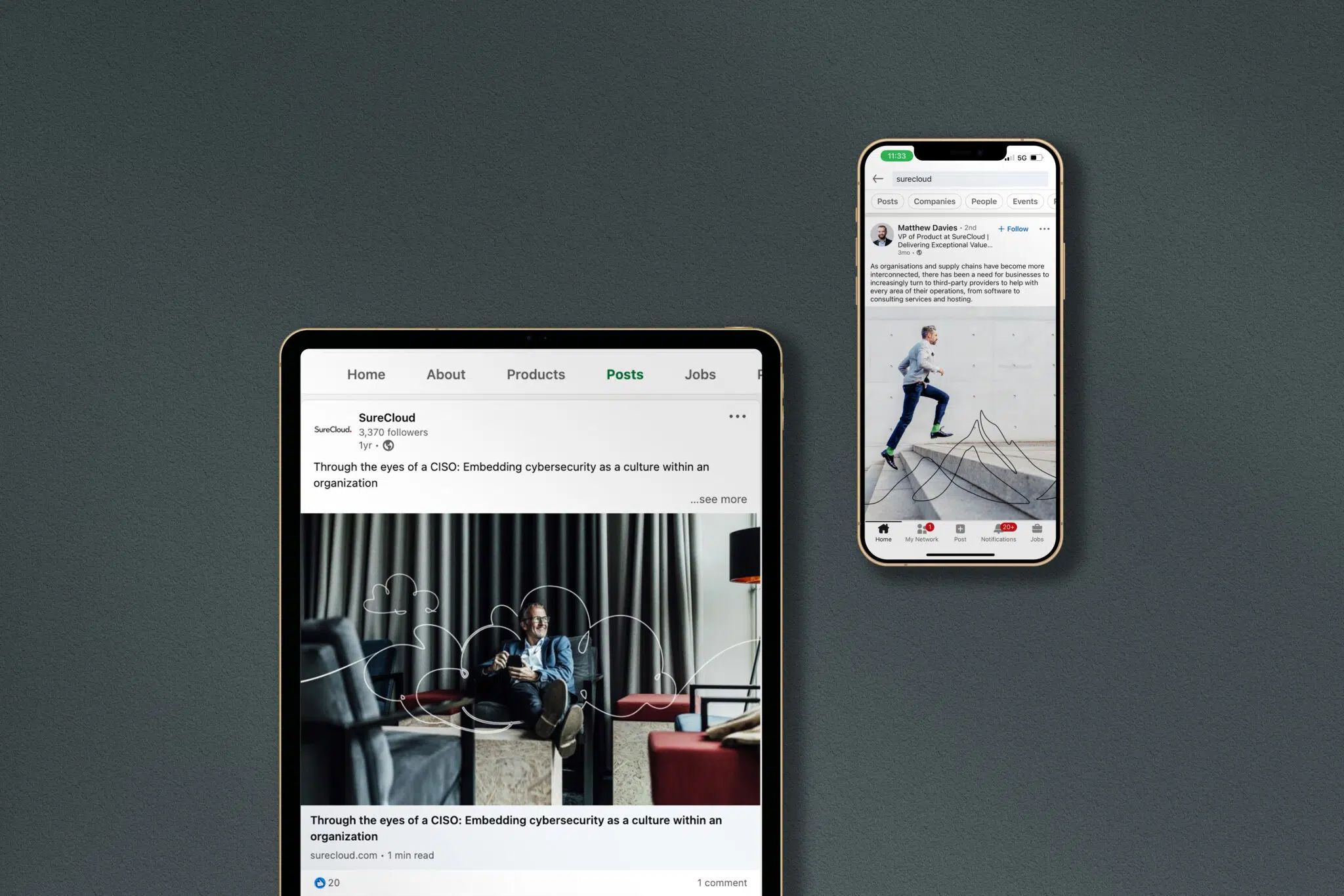
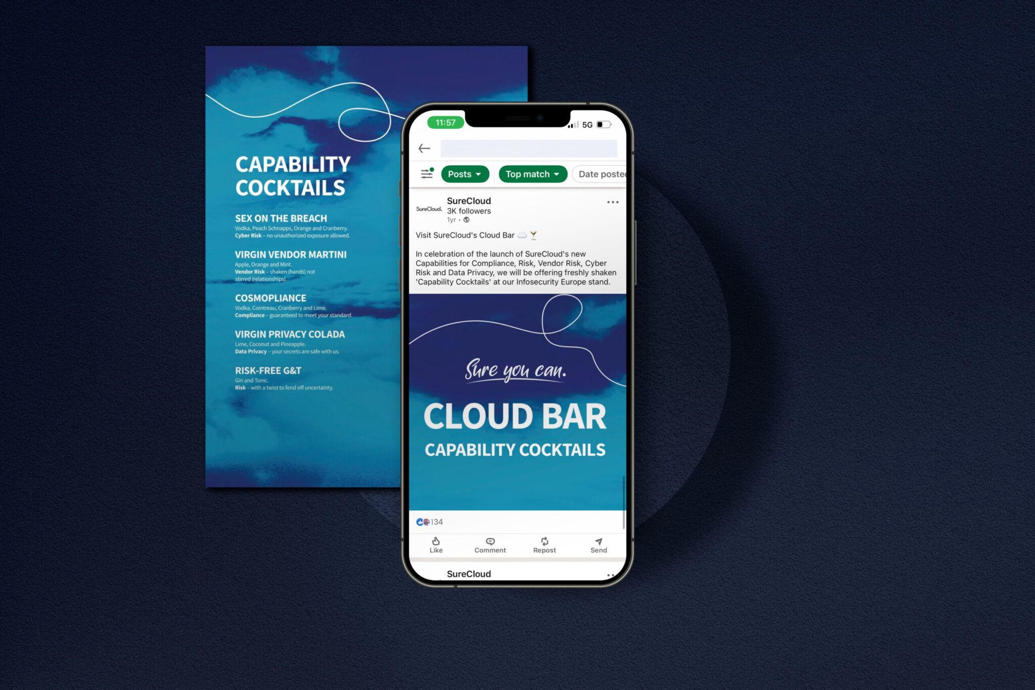
- Social and campaign content
- Sales and presentation materials
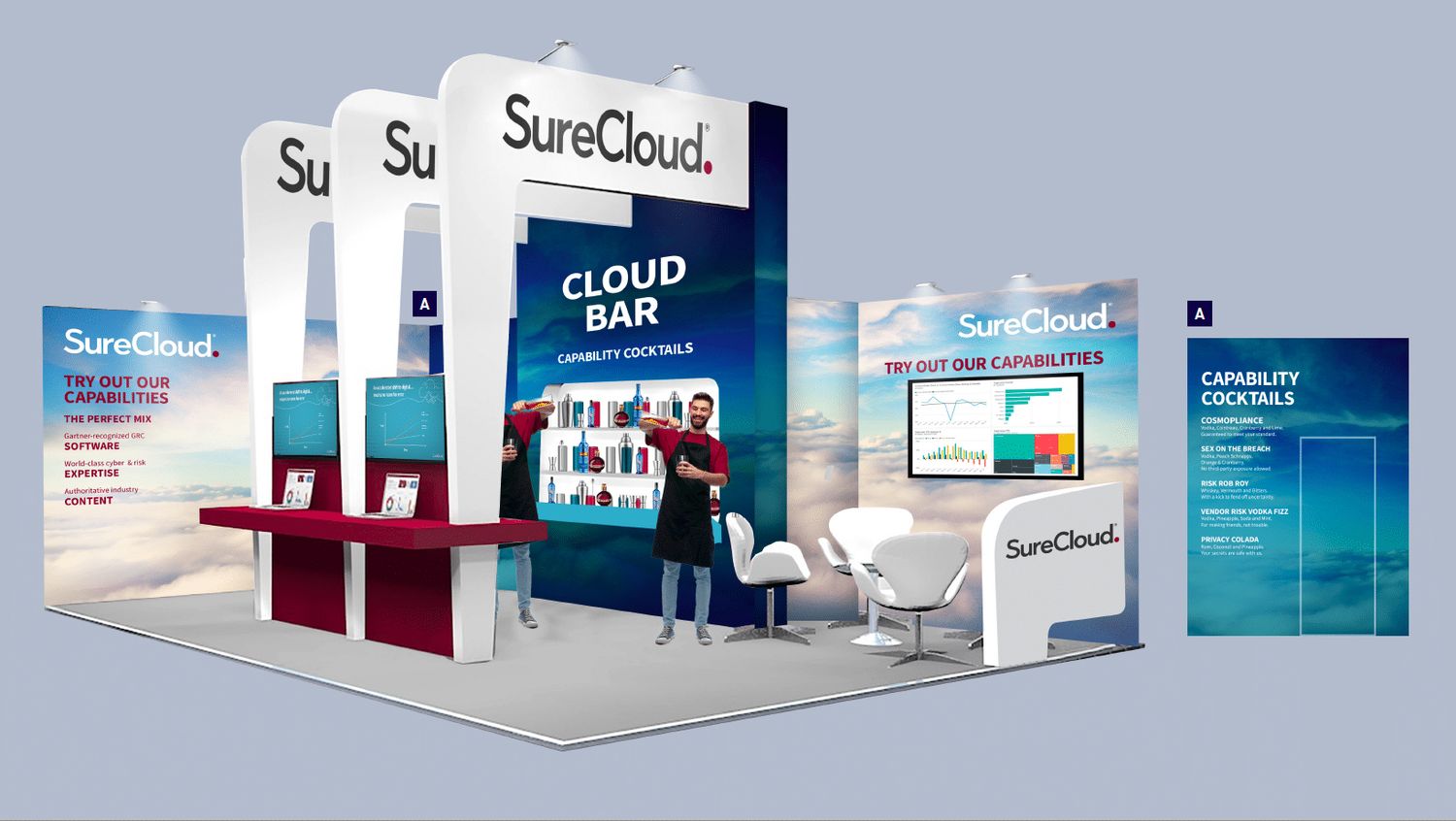
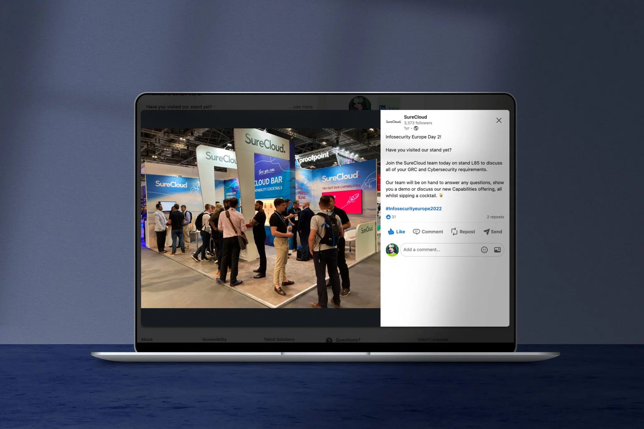
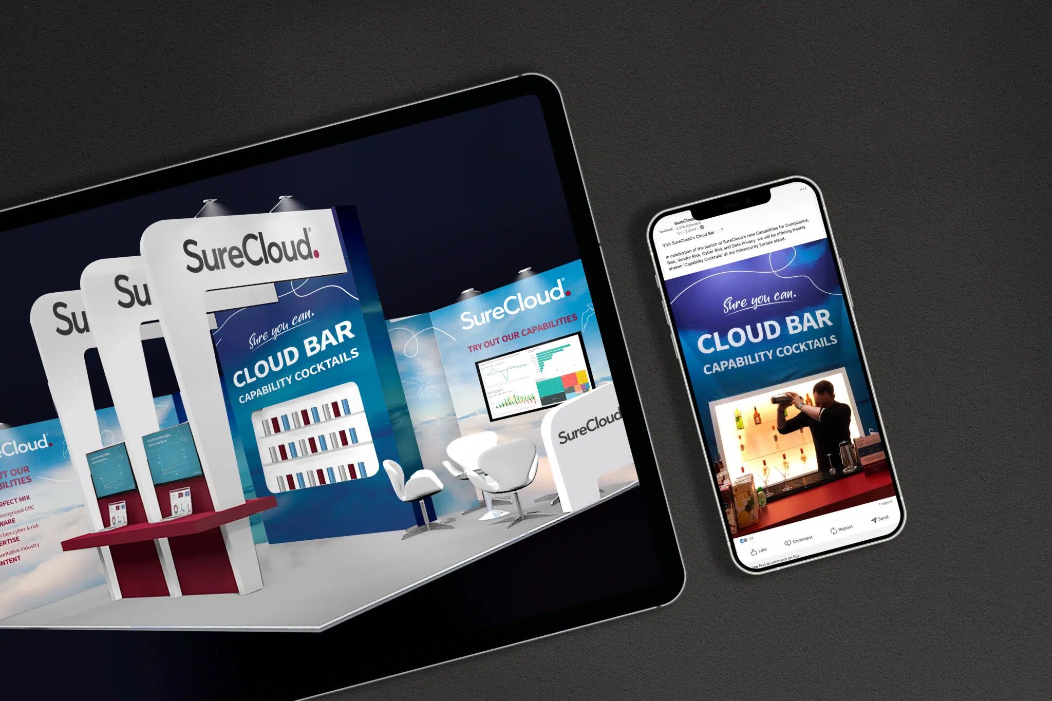
- Event and physical brand applications
- Supporting brand documentation and rollout materials
The work required consistency across multiple formats, while ensuring the brand remained clear and usable for internal teams.
Outcome
The rebrand successfully unified the business under a single, cohesive identity, providing a stronger foundation for growth and market expansion.
The new brand enabled clearer communication of SureCloud’s offering and supported both internal alignment and external positioning in a competitive market.
My Role
Senior Designer
- Contributed to brand concept development and visual execution
- Delivered assets across digital, campaign, and brand touchpoints
- Supported rollout and consistency across multiple channels