INTERSECT
Building a unifying identity for a complex, decentralised ecosystem
Overview
Intersect was created as a membership organisation to bring together stakeholders across the Cardano blockchain ecosystem — from developers and operators to investors and community members.
I worked on the creation and rollout of a new brand designed to unify these diverse audiences, translating a complex and highly technical space into a clear, credible, and engaging identity.
The Challenge
The project required balancing multiple, often competing needs.
The brand needed to:
- feel neutral and trustworthy across different stakeholder groups
- communicate credibility within a highly technical and scrutinised space
- remain accessible and engaging to a broad, global audience
- avoid the clichés and visual noise often associated with blockchain brands
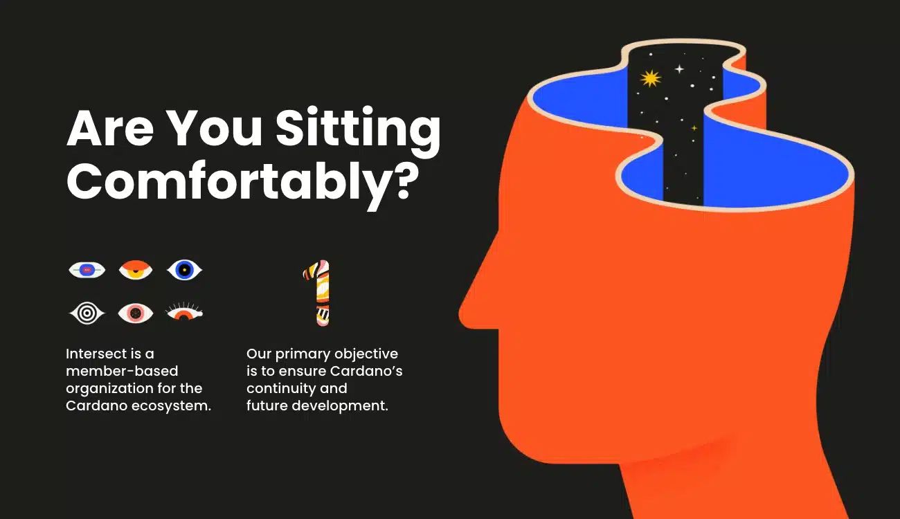
At the same time, it had to pass a fundamental test — why this organisation exists, and why people should care enough to engage with it.
The Approach
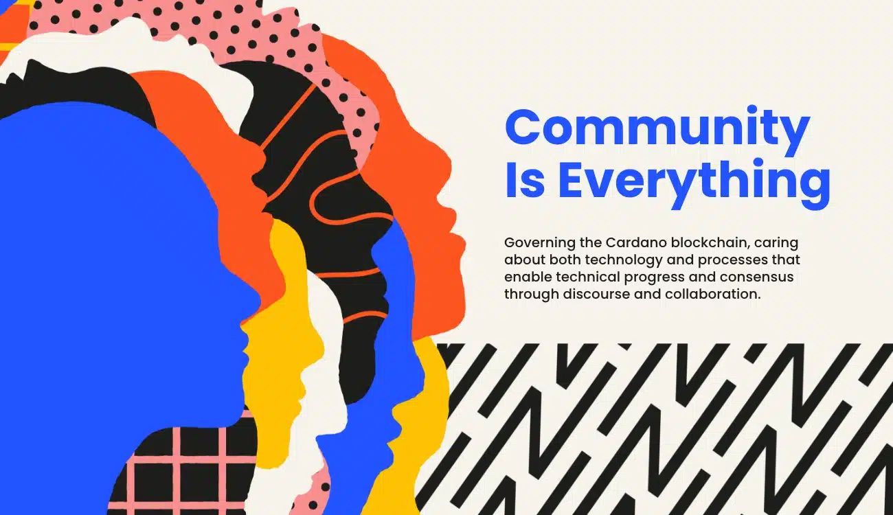
The creative direction focused on the idea of connection — bringing together different voices, perspectives, and areas of expertise into a single, unified space.
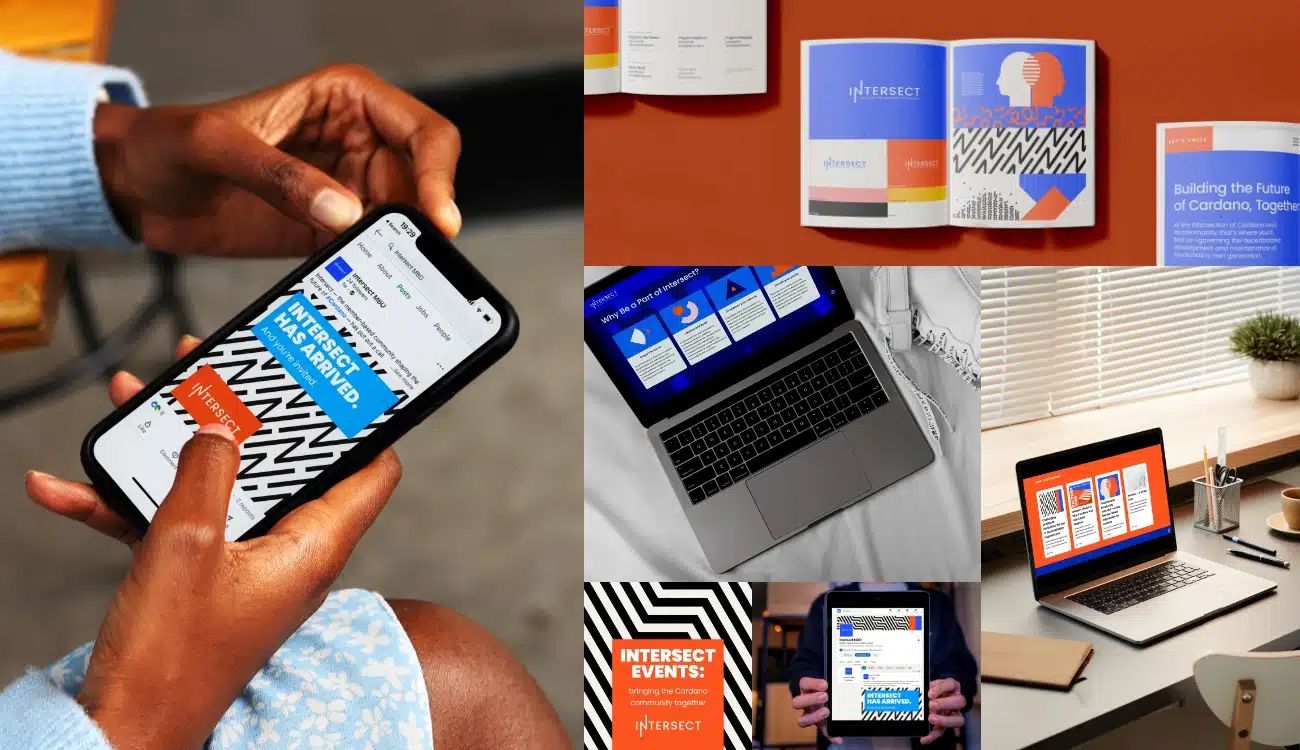
I contributed to translating this into a flexible visual identity system that balanced clarity with energy. The name Intersect became a central anchor for both the concept and execution — representing a meeting point for ideas, collaboration, and decision-making.
From a design perspective, this meant creating a system that could:
- feel credible and authoritative without becoming overly corporate
- remain visually engaging and distinctive within a complex category
- scale across different audiences, regions, and communication types
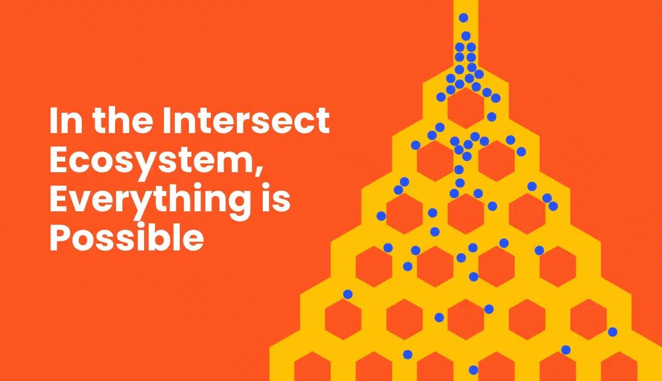
Colour, pattern, and layout were used to reflect collaboration and movement, while maintaining enough structure to support clarity and usability.
Execution
I worked across the development and application of the brand, ensuring it functioned effectively across both strategic and practical outputs.
This included:
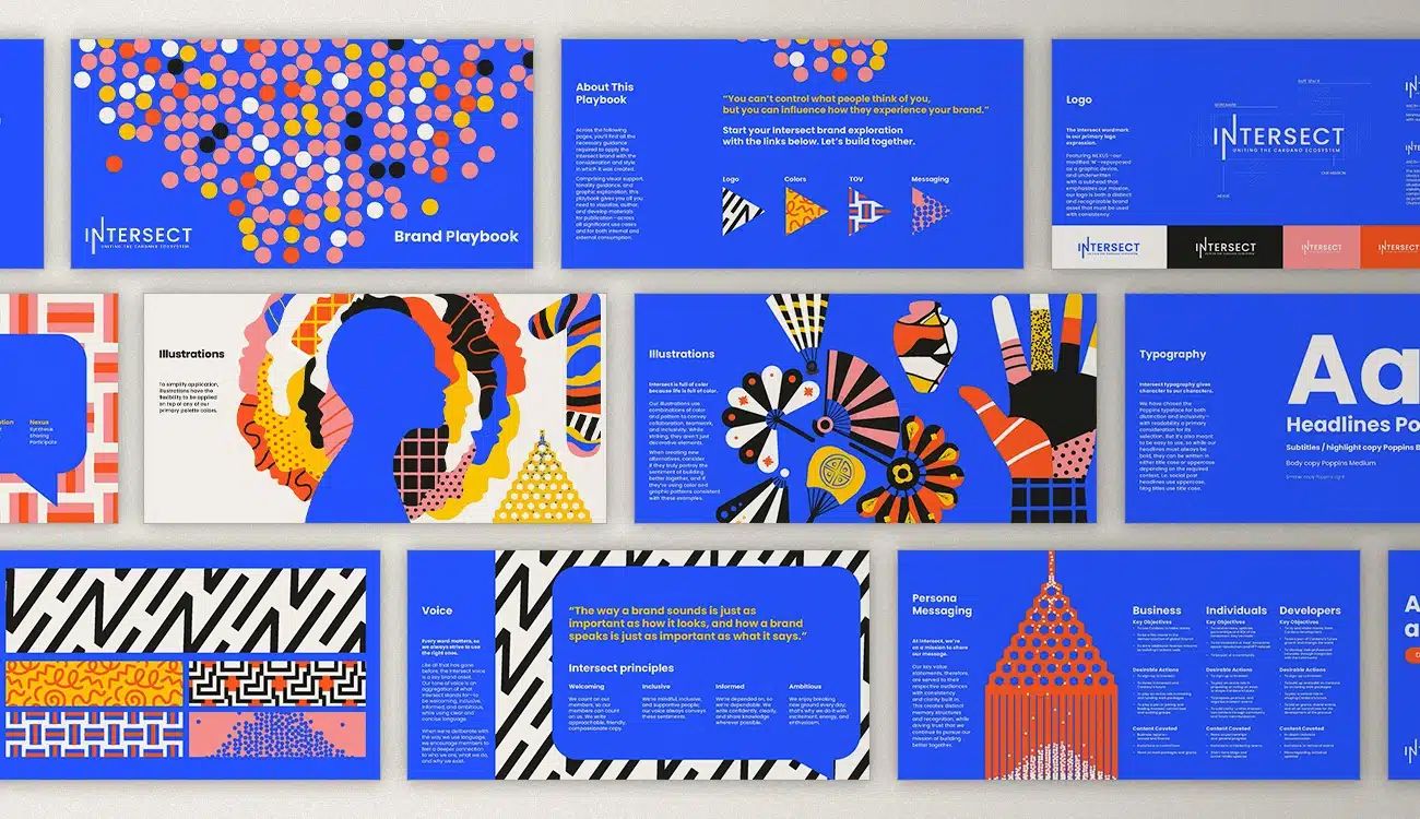
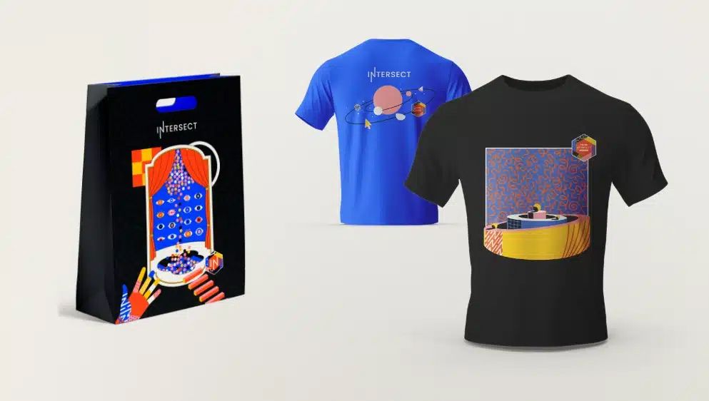
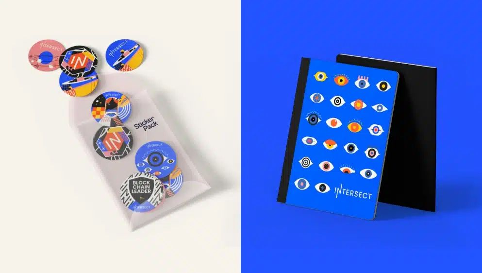
- Supporting the creation of a scalable visual identity system
- Applying the brand across digital and social touchpoints
- Contributing to brand guidelines and supporting documentation
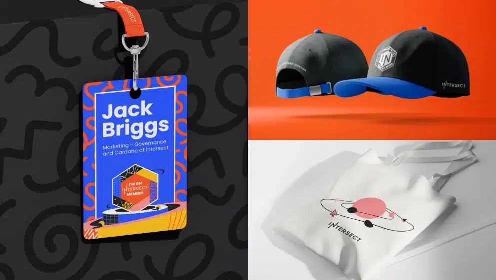
- Ensuring consistency across different audience communications
A key part of the execution was ensuring the brand could be adopted globally — providing enough structure for consistency, while allowing flexibility for different regions and use cases.
Outcome
The brand launched successfully across digital platforms, establishing Intersect as a credible and unifying presence within the Cardano ecosystem.
It provided a clear identity that stakeholders could rally behind, supporting engagement, communication, and long-term growth of the organisation and its community.
My Role
Senior Designer
- Contributed to brand concept development and visual identity creation
- Delivered design across key brand touchpoints
- Supported the development of scalable brand guidelines and rollout